

Share


Rebecca Bruggman, Experimentation Program Manager at Optimizely, originally published this post on Medium.com. Optimizely is a vendor-level sponsor of Click Summit 2019.
Do you have an open debate that is at a stalemate that could benefit from more data to inform a path forward? Not sure how to find new, impactful ideas for testing in your product?
Here are three real-world examples from Optimizely’s Product team to help inspire you to play bigger with experimentation and try some new tactics when experimenting.
1. Run a painted door experiment before committing resources
A “painted door” test, also known as a fake door, creates a minimal user experience, like a button with the feature’s name, that suggests a feature set and measures the number of users who engage with it. Behind the painted door, you may include a survey or some other mechanism for collecting additional qualitative data. A “painted door” test can be used to validate customer demand.
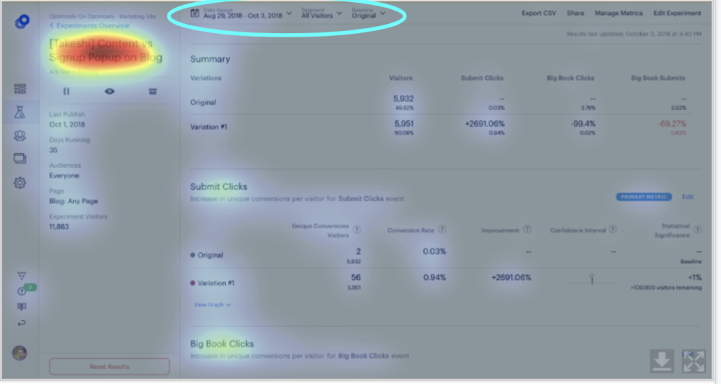
Optimizely Product Manager Whelan Boyd wanted to determine the interest for a new feature that would reduce the time to statistical significance but first wanted to quantitatively measure how important this problem really was before committing his engineering team to build the feature.
For context, if a test reaches statistical significance, it means the difference in visitor behavior observed, like an increased click through rate, was likely caused by the test variation and not due to pure random chance. In other words, the user can be confident that the a/b test influenced visitors and can make a decision on what to do with that insight.
Whelan wanted to know if users would be more likely to create and start a/b tests if they thought they’d reach statistical significance sooner.
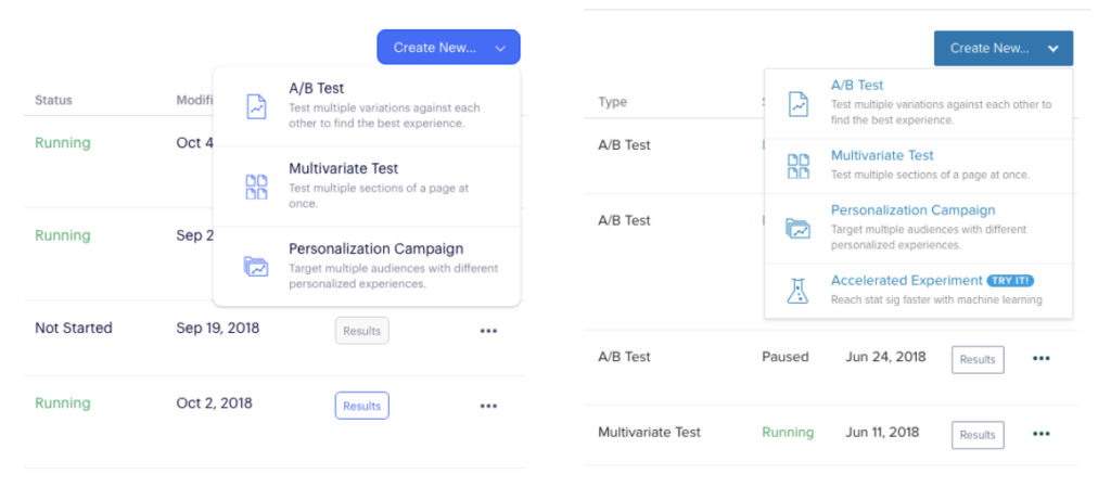
When users clicked on the new list item, they were clued into this being early access and encouraged to take a survey to share more details about their interest.
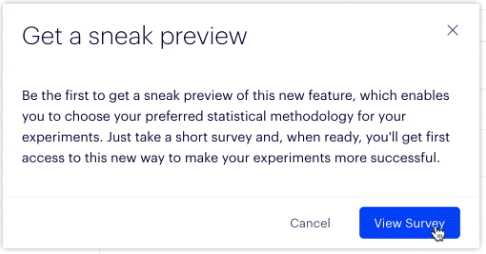
Seeing that a number of customers clicked on the “Accelerated Experiment” option in the dropdown and that some even went on to fill out the survey, gave Whelan the confidence to put this feature into our product roadmap.
What future bets are you thinking about that could use some additional external validation?
2. Use data to help settle a heated debate
Has a conversation like this ever happened when you’re doing an audit of your product UI?
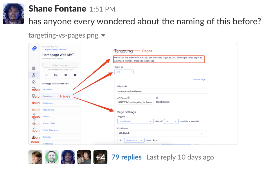
Clearly, our product team and many other cross-functional teammates are very passionate about making sure the language in our product is descriptive! For us, this came from an area in our product that was described as “Targeting” and navigates to selecting which URL an experiment will run on. With an umbrella term like “Targeting” this could also designate the “who” (ie. Audiences) behind “Targeting” the experiment, which led to this Slack debate.
With experimentation you can funnel this energy and debate into ideas that can be validated with data. Often, this sort of discussion runs on opinions and ends in a stalemate. Having data to inform how we could update this copy via an experiment is extremely valuable.
Thankfully, about 60 comments into this discussion, one of our product managers suggested we run an experiment to help get more data. We hypothesized that making the copy more explicit would cause less confusion and increase velocity of experiment builds, so we created a couple of different variations. This experiment is still actively running for us and nearing statistical significance! We’re hoping Stats Engine will be able to call a winner in the next few weeks.
What hot topics at your company could benefit from more data to inform a path forward?
3. Learn your key retention metrics, then optimize them!
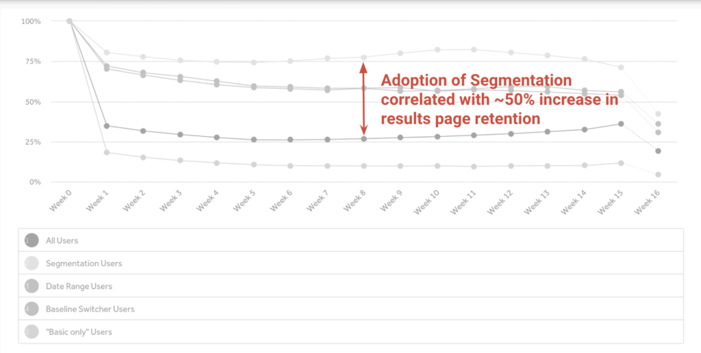
One of our key retention metrics for our data squad (our engineering team responsible for our results page and other data-related features) is the number of customers within a given account that visit the results page frequently. When our former product manager, Evan Weiss, sat down to look through his retention data, he noticed that a specific feature, called segmentation led to higher retention rates on our results page:
After making this discovery, he used a heat-mapping tool to see how discoverable this feature was for customers:
The area I’ve circled with the bright blue oval is the segmentation feature. The heat map showed that this feature was not easy to find. He had a hypothesis that if he could make this feature more visible, it would get more usage and, in turn, lead to higher retention on the Results page.
So, what did Evan do? He created a variation in our visual editor to move the segmentation bar closer to the center of the page to make it more visible to users. He then ran the variation through the heat mapping again and saw that the segmentation bar was now more discoverable:
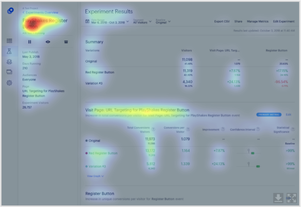
Below, are the Original and Variation side-by-side:
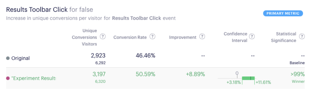
When he ran the experiment, he saw a statistically significant result of customers using the segmentation dropdown! This is especially awesome as it’s a leading indicator for a more lagging, higher impact retention metric.
What are the key retention metrics in your product? What areas can you specifically optimize to move the needle both for immediate impact and long tail retention?
Related Resources

How to Become an Insight-Driven Organization in 2024

April 10, 2024
The Pitfalls of Change Management

March 20, 2024
How to Kill A Silo

March 6, 2024
What is an insight?
February 20, 2024
Dynamic Research Integration: Unleashing the True Power of Insights
December 14, 2023
Demystifying Complexity: Workshop Facilitation for Organizational Growth and Alignment
November 16, 2023
Building Insight-Driven Organizations with Industry Trend Forecasting & Emerging Practices

October 26, 2023

AI’s Lustrous Promise: A Double-Edged Sword?

September 6, 2023